The Power of Colors in eStore Design

Colors do more than just pleasing the eyes. They evoke different emotions and actions in humans and are a powerful tool capable of influencing decisions and brand perception. The strategic use of colors on your website can significantly impact brand memorability, customer engagement, and even revenue. For instance, red can evoke excitement and urgency, making it suitable for call-to-action buttons, while blue is often associated with trust and dependability, ideal for tech or financial services. Here’s how you can harness the magic of color to make your eStore stand out.
Selecting the Right Color Scheme for Your Brand
1. Align with Your Branding Guidelines
Your website’s color scheme should reflect your brand’s identity. If you already have established branding guidelines, use them as a foundation for your web design. This ensures consistency across all platforms and helps in building brand recognition.
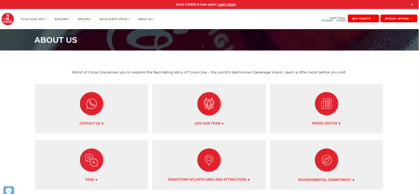
2. Take Inspiration from Existing Materials
If you don’t have a predefined color palette, look at your logo, packaging, and marketing materials for inspiration. These elements often already embody your brand’s essence and can guide your web color scheme. Etsy uses shades of orange, drawing from its logo, to create a cohesive and inviting online marketplace.
3. Refine and Expand Your Palette
While sticking to your brand colors is essential, don’t be afraid to expand your palette with complementary shades. This adds depth to your design and helps distinguish different elements on your site.
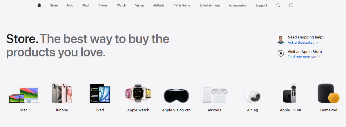
How Designers Create Effective Color Schemes
Focus Colors: These are the primary colors central to your brand. They should be used consistently across your site for key elements like headers, buttons, and calls to action.
Neutrals: Colors like black, white, gray, and brown are versatile and help balance out brighter focus colors. They ensure that your site looks professional and not overwhelming.
Monochromes and Pastels: Different shades, tones, and tints of your focus colors can be used to create a harmonious look. Pastels, which are lighter shades, can be particularly useful for backgrounds and secondary elements.
Complementary Colors: These are colors opposite each other on the color wheel, like red and green or blue and orange. Using complementary colors can make elements pop and draw attention to specific areas of your site.
Applying Color Psychology in eCommerce
- Red for Food and Entertainment: Red is dynamic and attention-grabbing. Brands like YouTube and Netflix use red to create a sense of urgency and excitement.

- Orange for Travel and DIY: Orange evokes energy and fun. It’s perfect for brands like JetStar Airlines and Etsy, which focus on travel and creativity.

- Yellow for Kids and Convenience: Yellow signifies joy and spontaneity, making it ideal for brands like McDonald’s and Best Buy that target a youthful, energetic audience.
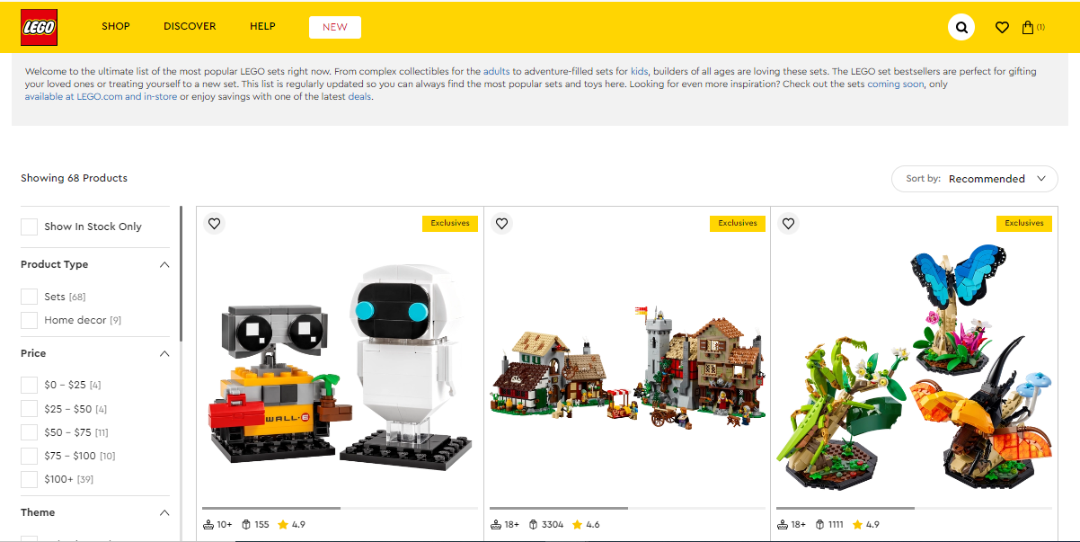
- Green for Eco-Conscious and Health: Green is synonymous with nature and health. It’s used by brands like Whole Foods to convey sustainability and wellness.

- Blue for Tech and Communication: Blue is calming and trustworthy, making it a favorite for tech giants like Facebook and PayPal.

- Purple for Luxury and Spirituality: Purple has been historically associated with royalty and wisdom. Brands like Cadbury and Hallmark use purple to convey luxury and sophistication.

- Pink for Femininity and Romance: Pink is nurturing and romantic, used by brands like Barbie and Victoria’s Secret to appeal to their primarily female audience.
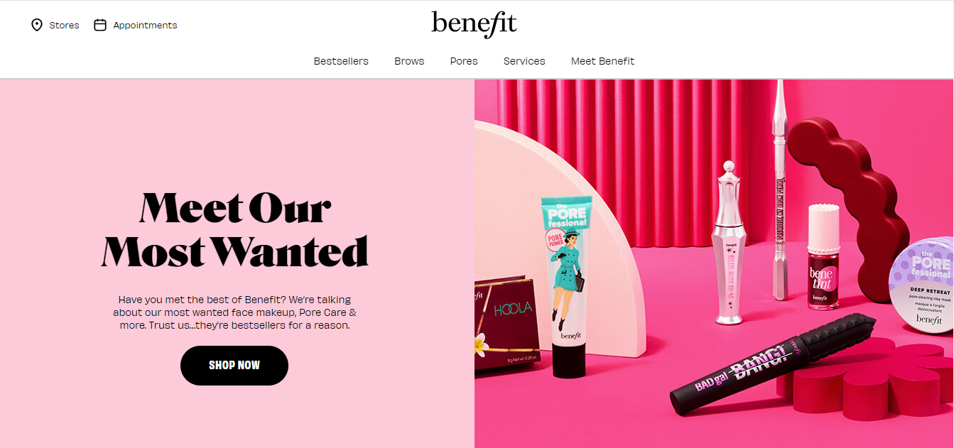
Creating the Best Background Palettes
For backgrounds, opt for:
- Pure and Near Neutrals: These are less distracting and help focus attention on your main content.
- Pastels and Monochromes: Light shades provide a soft background that complements your focus colors without competing with them.
- Tinted Textures and Images: Subtle gradients or semi-opaque images can add interest without overwhelming your design.
The colors you choose for your eStore play a crucial role in shaping your brand’s identity and influencing customer behavior. By understanding color psychology and strategically selecting and applying colors, you can create an engaging and memorable online shopping experience. Always prioritize brand consistency and user experience. A well-thought-out color scheme can be the key to standing out in a crowded eCommerce landscape.
Latest
Subscribe To Our Newsletter
We’ll send you the best of our stories and no spam! Promise!


