Enhancing Your eCommerce Store’s UI/UX

Imagine going to store where the products are scattered across different shelves with no coherent grouping and the signs are mislabeled. You will step right out, never to return. Similar thing happens if your website isn’t user friendly, customers will likely abandon their carts before making a purchase. Let’s look at how you can improve your eCommerce store’s user interface (UI) and user experience (UX) to create a seamless shopping journey that keeps customers engaged and drives sales.
Gather Customer Feedback
Start by collecting feedback from your current customers and target audience. Ask specific questions to gain insights into their experience, such as:
- Are there any bugs or issues with the website?
- Is the navigation intuitive?
- What improvements would they like to see?
- How satisfied are they with the customer service?
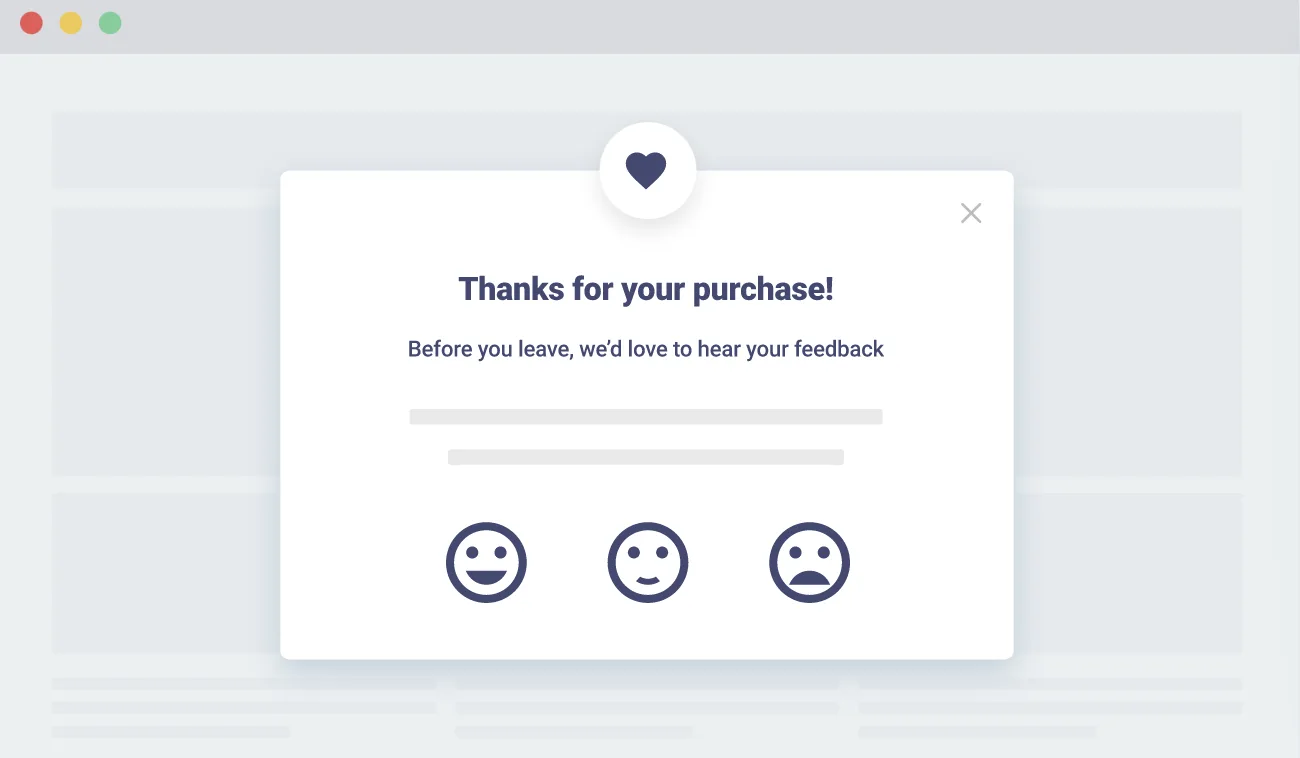
Conducting regular surveys and using tools like Hotjar for heatmaps can help you understand user behavior and preferences. Add pop-up feedback questions on completion of an order or small incentives such as 5% off on next order if you take this quiz motivate customers to give you feedback.

Strengthen Your Brand Visibility
Developing a brand identity is something that is ideally done before you set up your website to match your target audience’s expectations. However, if you’ve skipped this step or if it’s been long since you last revisited your brand identity, it’s a good idea to jot down a brand identity guideline such as overall style, colors, etc. Integrate your brand’s identity into the UI design to make your store easily recognizable. This includes consistent use of colors, fonts, and imagery that reflect your brand. Think Barbie. They’ve created one of the strongest brand identities and have managed to stick to it for the last few decades.
Simplify Navigation
The end goal of your store is to make sales. Navigation should be such that it intuitively leads a customer to the end point of purchase. Ensure your website is easy to navigate by:
- Organizing products logically
- Using clear symbols and signs
- Enabling search history
- Suggesting next logical steps for users
- Have the homepage accessible
- Show ratings and reviews
- Option to add items to wishlist or cart and continue shopping
Amazon changed the navigation system when it introduced the 1 click checkout, streamlining the process extensively for return customers.
Optimize for Mobile
With a significant number of shoppers using mobile devices, having a responsive design is crucial. Ensure your website loads quickly, has easy navigation, and provides a seamless shopping experience on mobile.
Improve Page Scannability
You’ve spent hours copy writing your content for the website, but the harsh truth is not everyone is going to read through the entire content. People often just scan your website and therefore, it is essential to enhance the readability of your pages by:
- Highlighting key benefits
- Using sub-headings and bullet points
- Keeping paragraphs concise
- Using high-quality images
Minimize User Effort
‘Smooth like butter’ maybe a song but it is true for ecommerce businesses. Making a purchase on your website should be a smooth ride for the consumer. You need to reduce the efforts required for users to complete purchases by:
- Simplifying the sign-in and checkout process
- Displaying related products
- Minimizing the number of clicks required
- Grouping items logically
Make the Homepage Informative
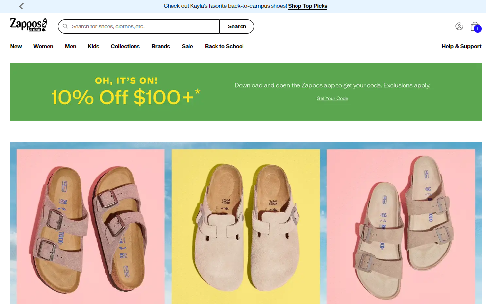
First impressions are last impressions in the case of online shopping. Your homepage is the opening act for your website. Nail that, and your users will stick around to explore more. Fail at it, and you immediately lose. Your homepage should be a comprehensive gateway to your store and should atleast include the following:
- Clear branding
- Best sellers
- A search box
- Customer support details/chatbox
- Links to social media
- Customer reviews and testimonials
Enhance the Checkout Process
Buying products should be as simple as 1-2-3! Simplify the checkout process by:
- Reducing the number of steps
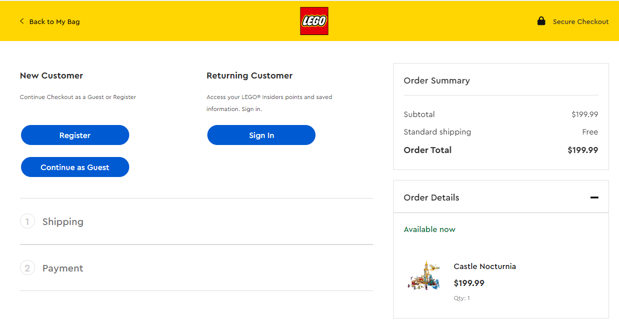
- Offering guest checkout options
- Ensuring security at each step

Provide High-Quality Images
It is a no brainer that you need to use high-resolution images to give customers a clear view of your products, helping them make informed decisions. Yes, you should include customer photos but keep that to product reviews or as special showcase on your social media handles/section. High quality images speak more than text and overcome language barriers.
Ensure Easy Access to Contact Information
Make your contact information easily accessible, and include clickable phone numbers and addresses that open in maps. Consider placing contact information in both the header and footer, making it easy for customers to reach out if your product demands frequent customer care.

To stay on top of your game in the eCommerce field, you have to continuously improve your UI/UX. By focusing on customer feedback, simplifying navigation, optimizing for mobile, and enhancing the checkout process, you can create a seamless and enjoyable shopping experience that drives sales and fosters customer loyalty.
Latest
Subscribe To Our Newsletter
We’ll send you the best of our stories and no spam! Promise!


